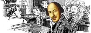

- Name: A Midsummer Night’s Dream by William Shakespeare. Adapted by Nel Yomtov (Adaptor), and Berenice Muniz (illustrator)
- Media: Graphic Novel compilation, with accompanying website https://www.mangashakespeare.com/titles/midsummer.html
- Ages: Pre Teen- teen. The story is highly condensed so older readers might want a more in-depth adaptation to understand the themes and ideas of the plot.
- Premise: This graphic novel is a good introduction to “A Midsummer Night’s Dream.” It tells the bare minimum of the story with very little dialogue and almost none of the original text. Most of the story is conveyed through the visual medium.
ABOUT THE ILLUSTRATORS (Reprinted from the graphic novel)
https://www.behance.net/berelince?locale=en_US
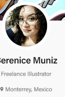
Berenice Muniz is a graphic designer and illustrator
from Monterrey, Mexico. In the past, she has done
work for publicity agencies, art exhibitions, and
she’s even created her own webcomic. These days,
Berenice is devoted to illustrating comics as part of
the CGraphikslava crew. In her spare time, “Bere”
loves to draw, read manga, watch animated movies,
play videogames, and kill zombies
Fares Maese is a graphic designer and illustrator. He
has worked as a colorist for Marvel Comics and as a
concept artist for the card and role-playing games
Pathfinder and Warhammer. Fares loves spending
time playing video games with his Graphikslava
comrades, and he’s an awesome drum player: https://faresmaese.artstation.com/
About the Retelling Author
The career path of Nel Yomtov has taken him from
the halls of Marvel Comics, as an editor, writer,
and colorist, to the world of toy development. He
then became editorial and art director at a children’s
nonfiction book publisher, and now Nel is a writer and
editor of books, websites, and comics for children. A
harmonica-honking blues enthusiast, Nel lives in
New York with his wife, Nancy. They have a son. Jess.
mY rEACTION
tECHNICAL eXECUTION
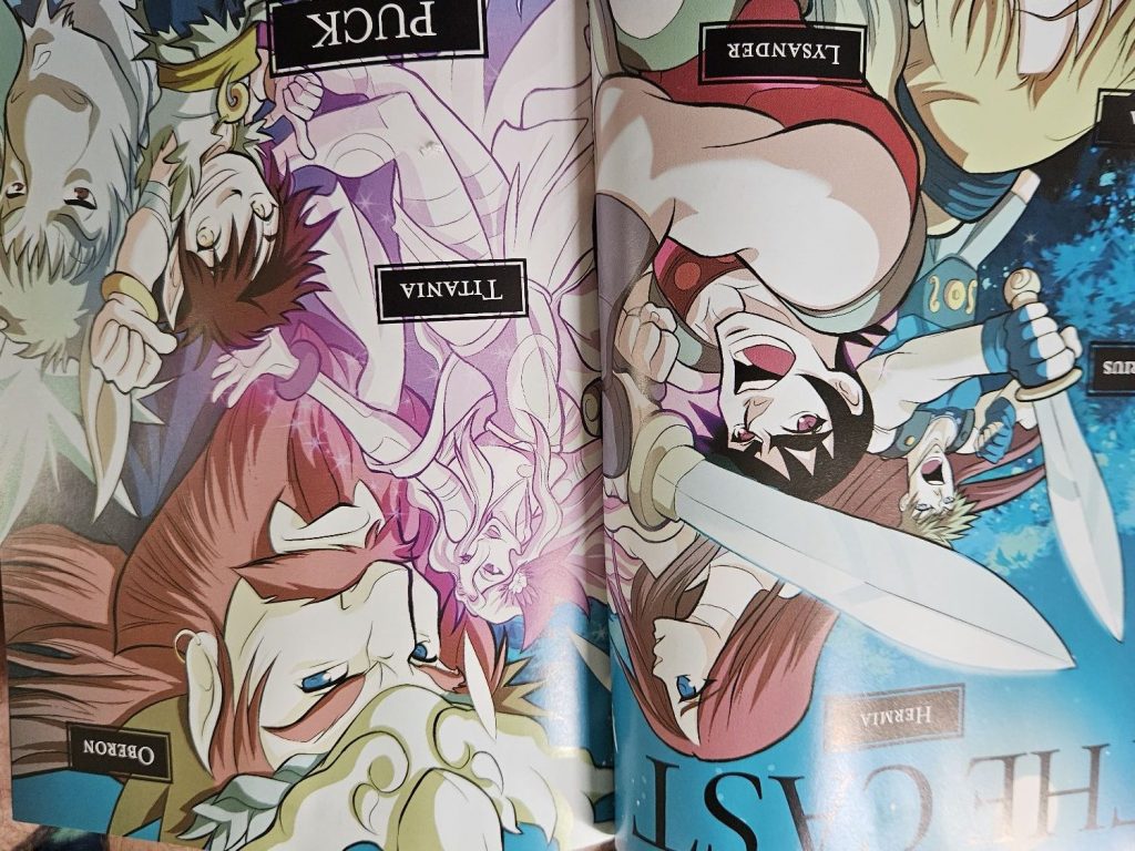
Character Design. It’s interesting to see the difference in style between this version, and the Manga Shakespeare version I previously read. That one was very much inspired by the Shoujo manga style, which emphasizes drama and relationships. This version’s drawings are softer, more cartoonish, and the expressions are less stiff, (except for Oberon, who is drawn very austerely). I particularly like the design for Puck with his big mischievous eyes and squat, childlike shape. I would argue however that the lovers and Mechanicals aren’t distinct enough, which is a problem since they are the most important characters.


The Adaptation
Like I said, this is a bare minimum adaptation of the play. None of Shakespeare’s text is used and the lines and speeches are cut liberally. The entire book is only 77 pages which of course means, that there are a lot of cuts. There’s no mention of the Indian boy, Titania’s tiff with Oberon, Philostrate, the other fairies, and all the great speeches are cut. This version is focused entirely on the plot, and it cuts it quite efficiently. To demonstrate this, below on the left is a panel that shows how Lysander and Hermia express their frustration with not being allowed to marry. On the right is the original text of the scene.
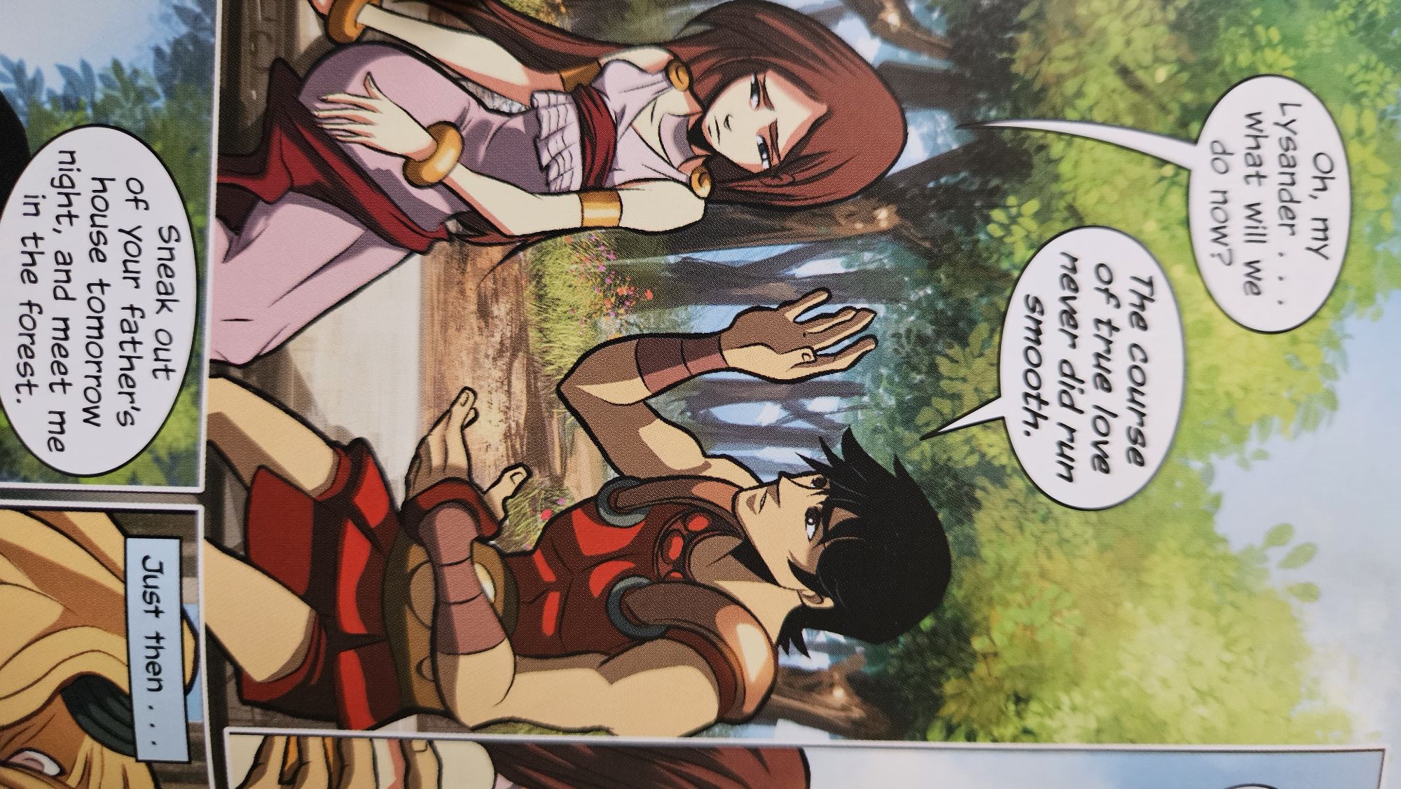
Ay me! for aught that I could ever read,
Could ever hear by tale or history,
The course of true love never did run smooth;
But, either it was different in blood,
Lysander. Or else misgraffed in respect of years,
Lysander. Or else it stood upon the choice of friends,
Or, if there were a sympathy in choice,
War, death, or sickness did lay siege to it,
Making it momentany as a sound,
Swift as a shadow, short as any dream;
Brief as the lightning in the collied night,
That, in a spleen, unfolds both heaven and earth,
And ere a man hath power to say ‘Behold!’
The jaws of darkness do devour it up: So quick bright things come to confusion.
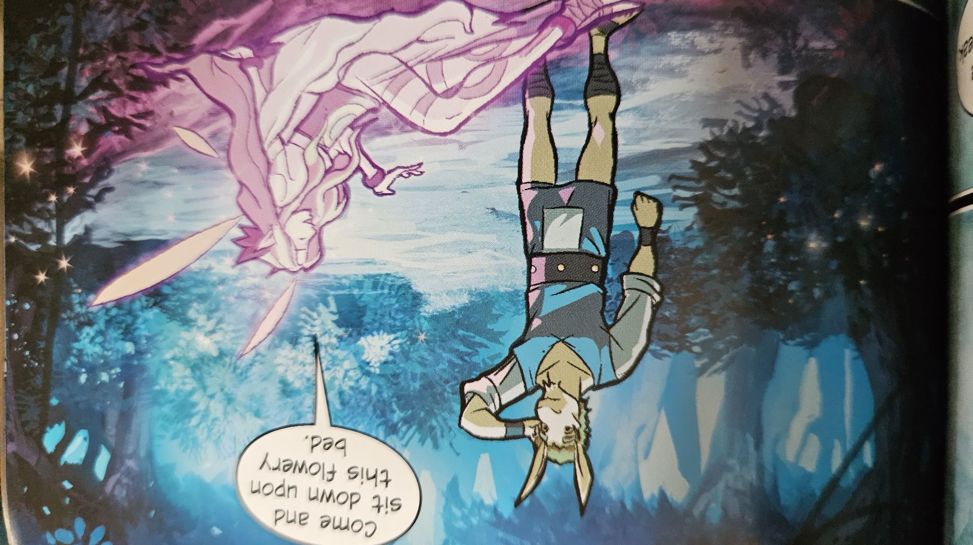
The Colors
The colors are very beautiful. Other manga stories have colorful title pages but no color in the panels. This comic is alive with color and the colors help tell the story. Athens represents the world of the daytime, so the colors are very warm and vibrant. In the nighttime, the colors are cool and the characters are drawn with very sharp lines to make sure they don’t fade into the background.

IN Conclusion
This version tells l the story quickly and entertainingly with a vibrant and colorful style that was lacking in the Manga version. Granted, the Manga Shakespeare did allow me to focus on the text more, but I think I actually prefer this version, simply because of its beautiful artwork. Check it out if you get a chance!.
